Introducing REX Academy.
REX Academy is a Technology Learning Platform (TLP) dedicated to making it easy to both learn and teach computer science. Their interactive and engaging curriculum with highly customizable content, provided them with a strong foundation, but in order to compete with more established platforms, there were problems that needed to be resolved. Over a 9-week period, I worked with 3 teammates to address these issues.
The Problem.
REX Academy was ready to take their TLP to the next level, but with clear usability issues and no existing research to inform solutions, they needed our help.
CHALLENGE:
Design a more effective and intuitive way for students to view announcements, navigate to their courses, learn and practice, submit assignments and view grades and feedback.
Research begins.
We needed to know more. Our team got busy learning about REX Academy and after gathering all of the information we possibly could from the stakeholders, we turned our focus to finding out more about our user, and our competition. We accomplished this by interview students and examining other TLPs.
The student.
Exactly who is our user? What are they interested in? What motivates them? How can we make their life better? We needed to find out.
We conducted one-on-one interviews with carefully crafted questions designed to learn as much as possible about the user and discover their needs and wants. We also observed these students using REX and noted pain points.
The competition.
Simultaneously we were checking out the competition. We looked at direct competitor’s sites such as Khan Academy and Code.org as well as other learning sites like Udemy and Canvas. What are they doing well? What is missing? I created a spreadsheet to allow us to easily analyze the results.
WOW, that’s a lot.
Time to synthesize.
Now with an almost overwhelming amount of information to process, we needed to make sense of it. Our team used a variety of methods to glean helpful insights.
First we created an AFFINITY MAP with sticky notes of our discoveries: significant comments from our users, and findings from our competitive studies. Grouping these ones allowed us to discover patterns, uncover some pain points, some gaps, and notice what was working.
From there I worked on building an EMPATHY MAP to get a clearer picture of our user and used this information to create the JOURNEY MAP. Now we had a much clearer picture of our user and how we could help their experience.
Meet Lewis, the Persona.
Lewis, I feel your pain.
Confusion.
Hierarchy isn’t clear. Tracking course progress is confusing. I’m not sure what I need to work on net. I didn’t realize there was gamification. Where are the announcements?
Boredom.
I want to see more color. It looks too childish. It feels too old for me. I wish there was less white space. The copy is all so small. I wish I could connect with my classmates. The gamification could be more interesting.
Lack of motivation.
I want to view everything I’ve completed. How do I compare to my classmates? I wish you could earn badges and level up. Could I chat with my classmates here?
Back to the drawing board.
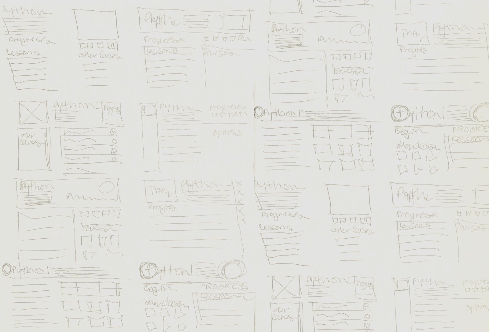
Ideation.
We narrowed our focus to four specific areas:
Navigation
Course Overview
Courses
Gamification
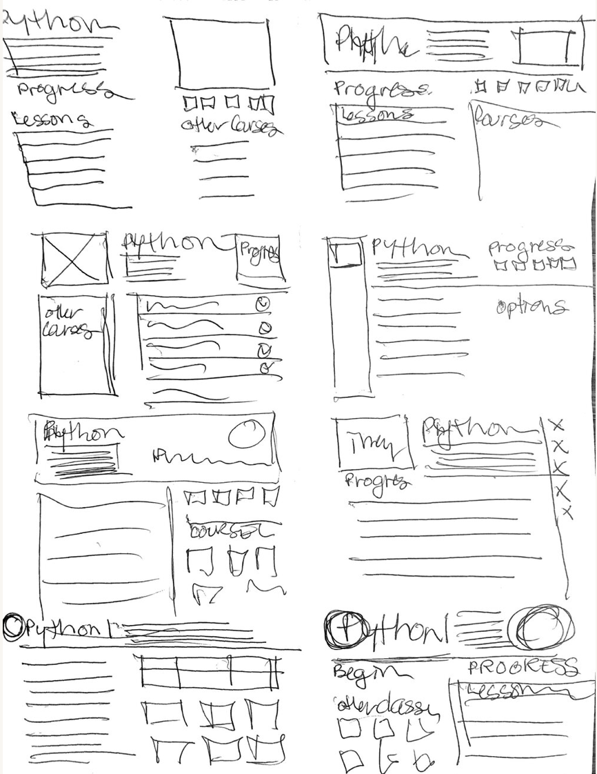
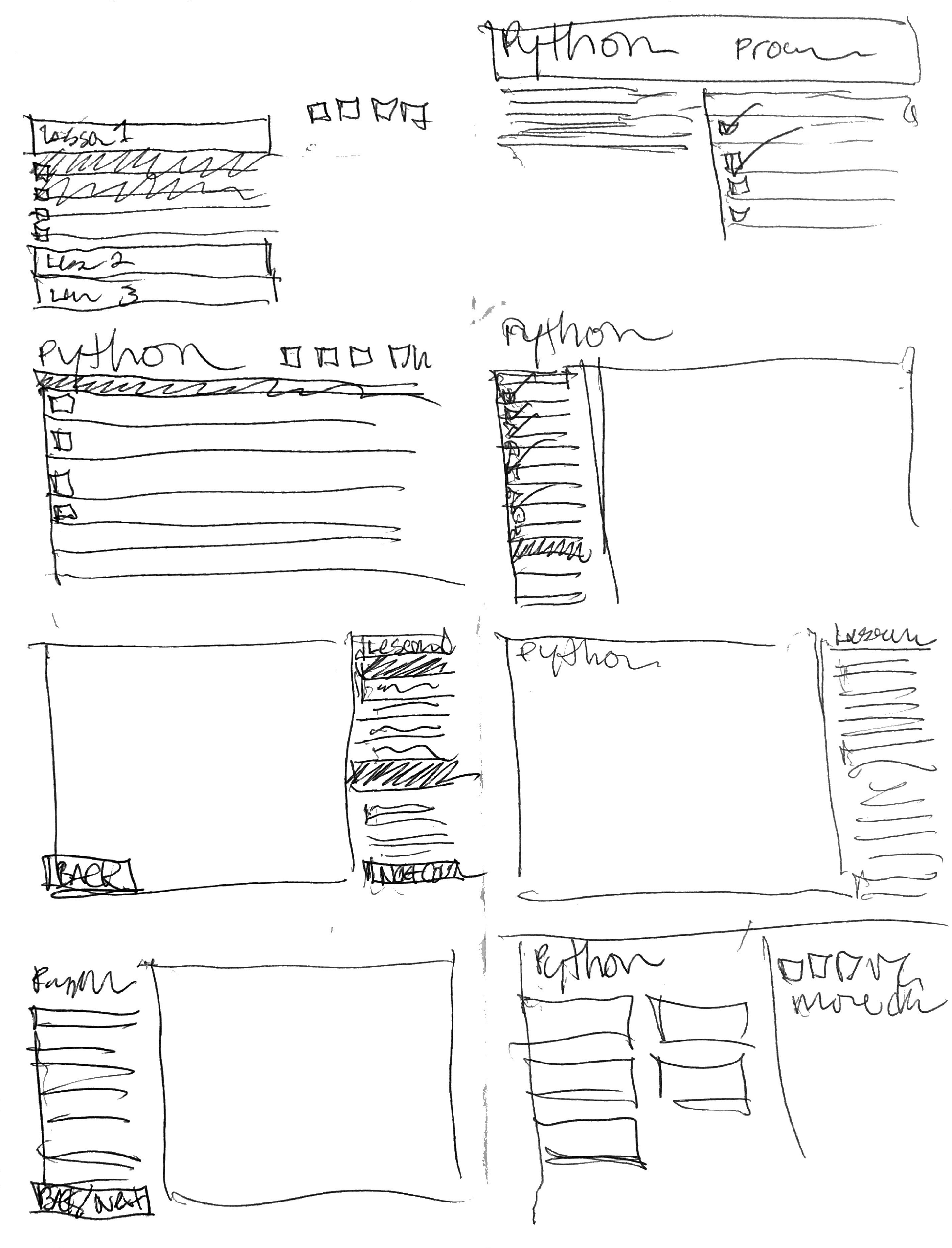
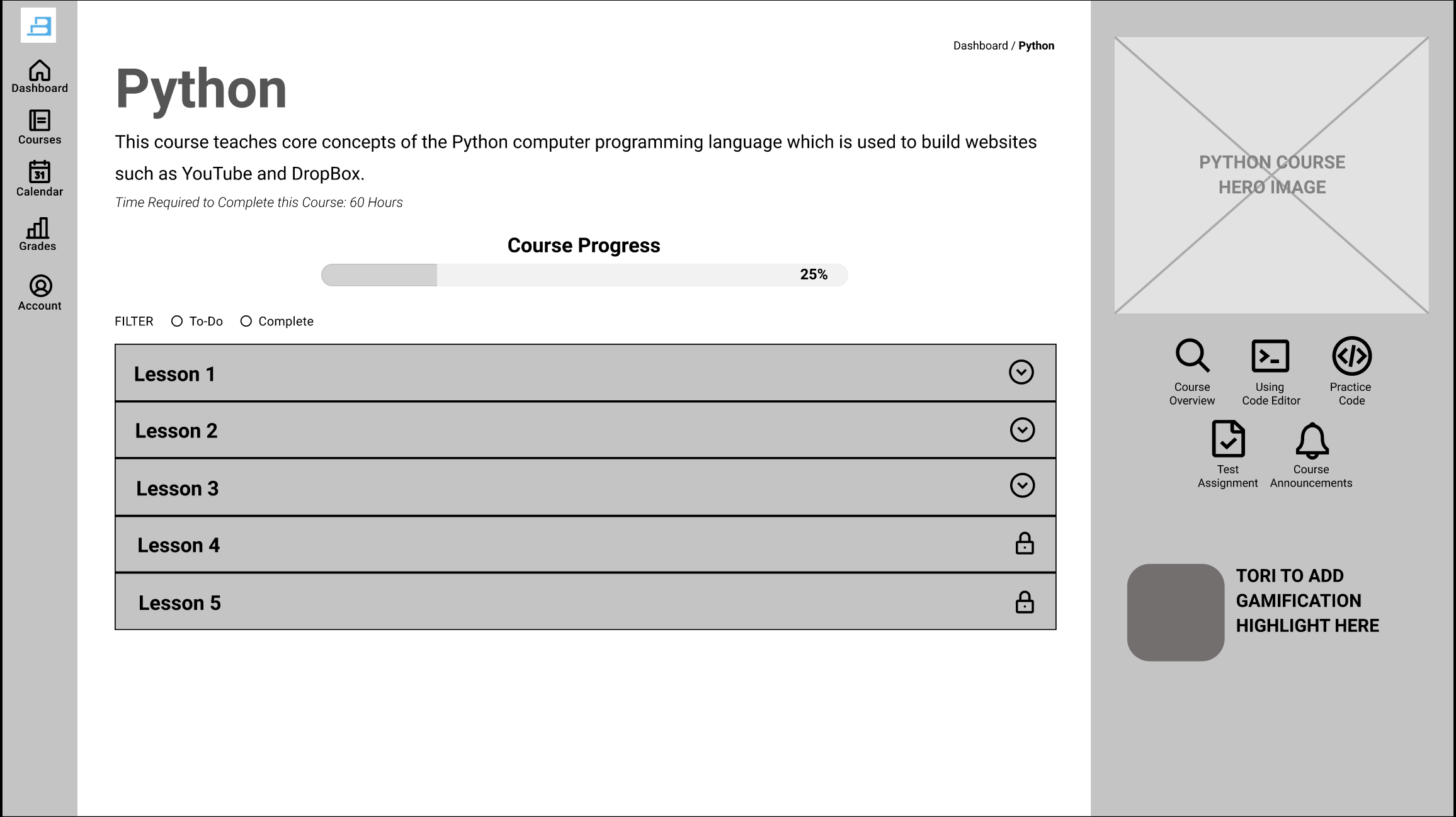
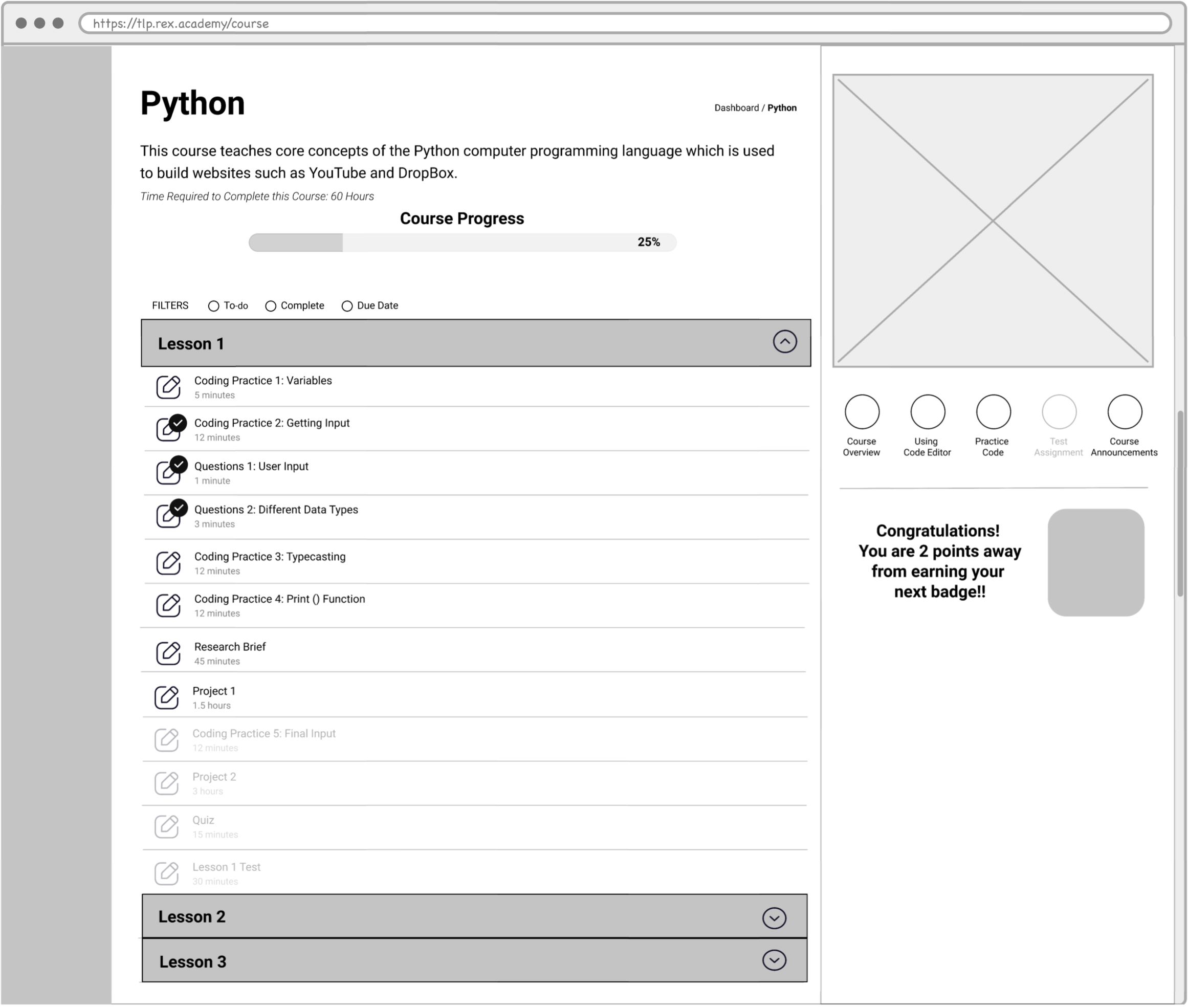
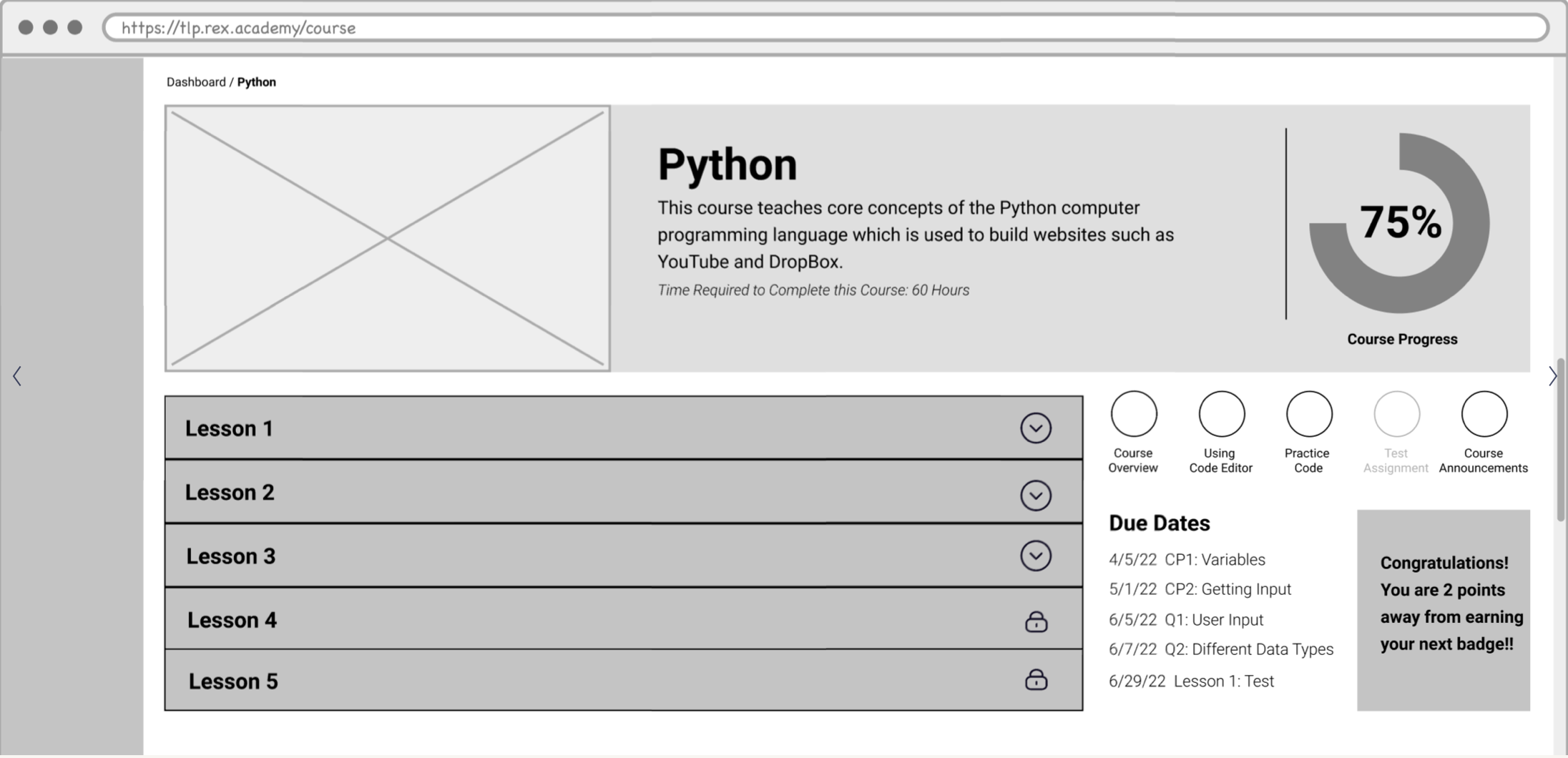
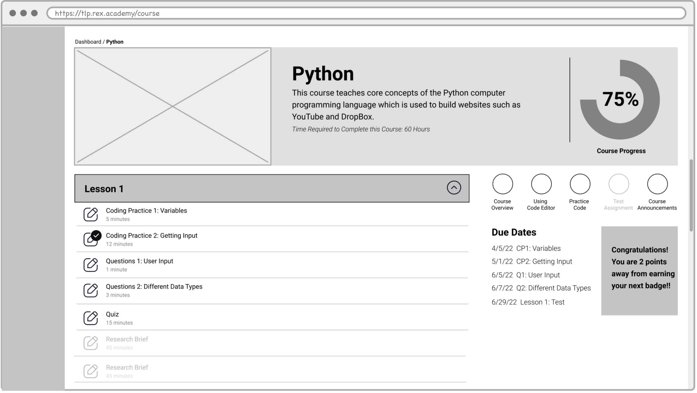
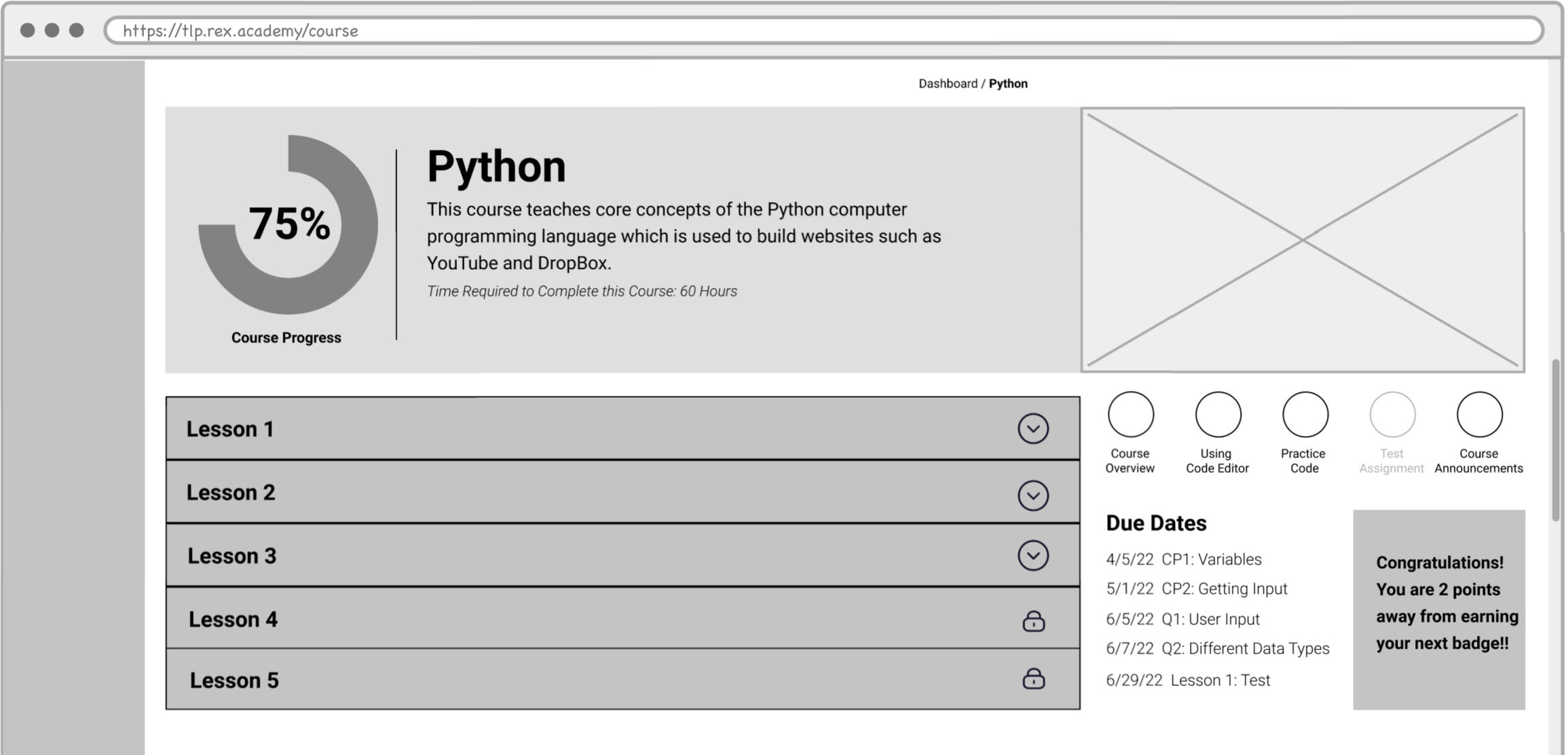
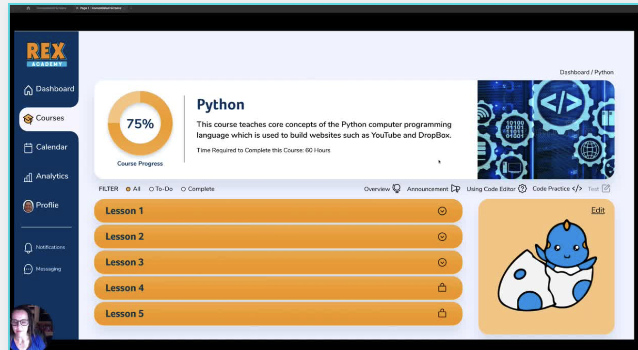
With discovery research completed and persona in hand, I worked on the Course Overview page and created various user flows and an updated user journey to help with ideas before sketching. Choosing team favorites, I moved to medium fidelity wireframes followed by prototypes. We user-tested our prototypes, incorporated a few new insights and were ready to present our high fidelity prototype to the stakeholders.
Research + synthesis + sketches + prototype + user testing + iterations + SUCCESS
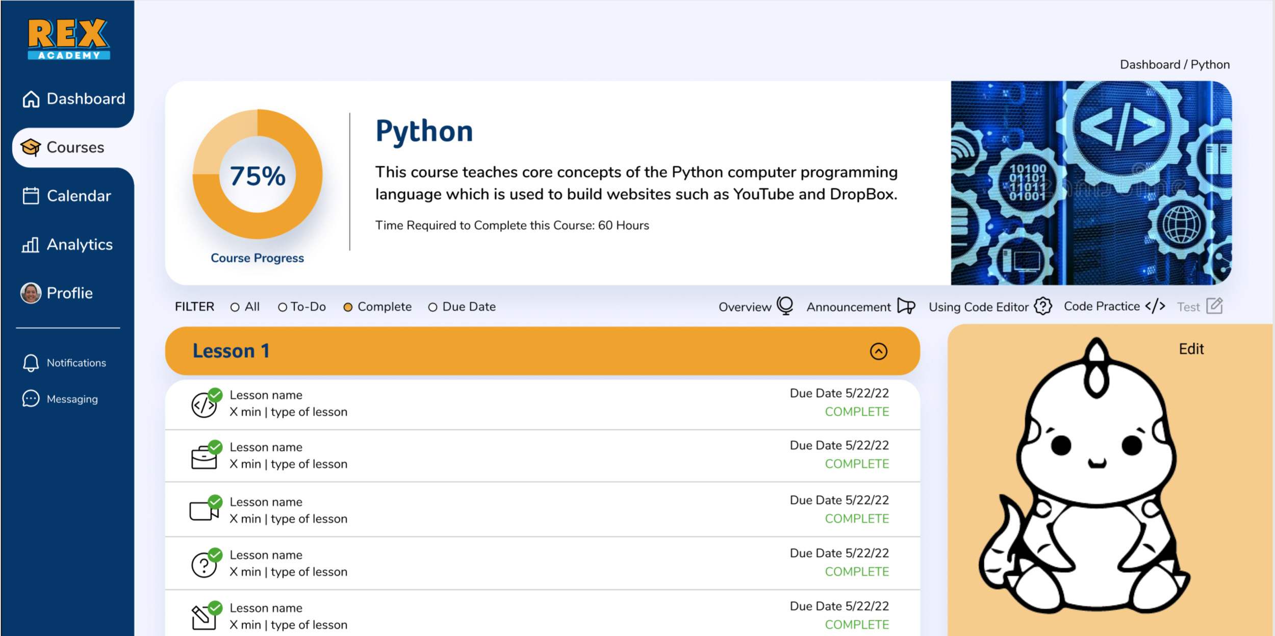
Earlier iteration of Python course
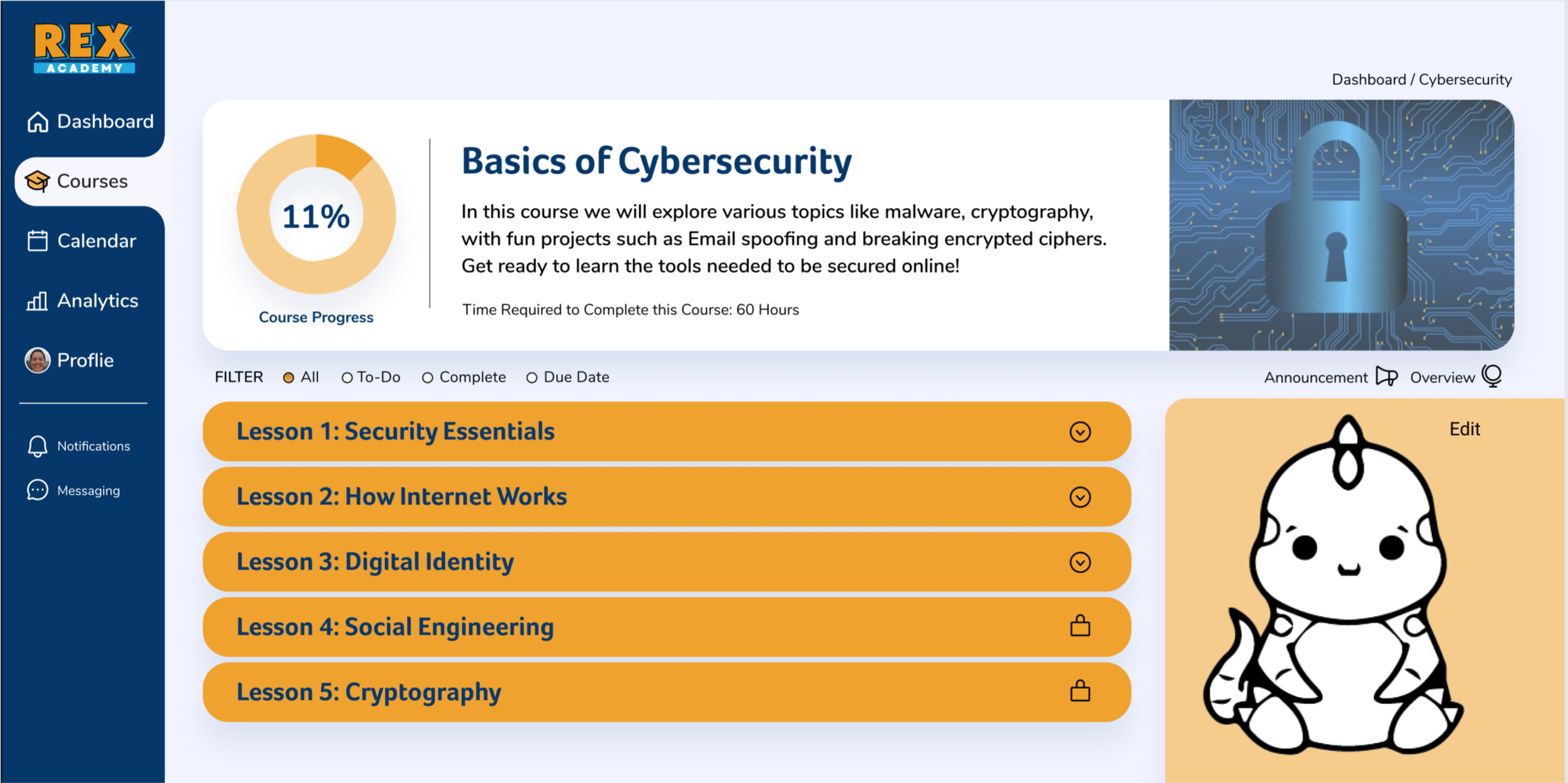
Earlier iteration of Cybersecurtiy course
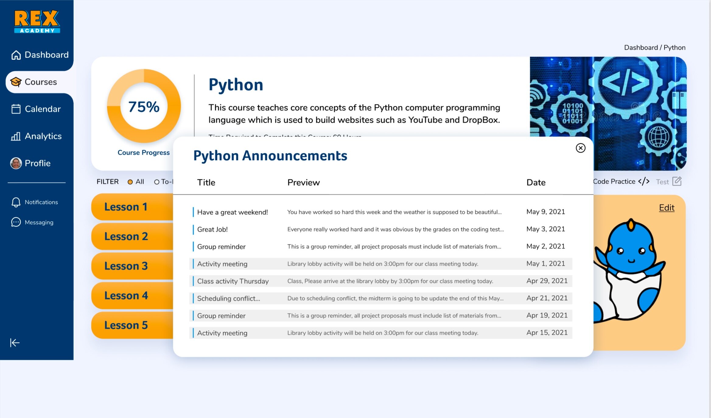
Announcements selected from Python toolbar to show pop-up

Filter selected to show all completed tasks in Lesson 1 of Python.
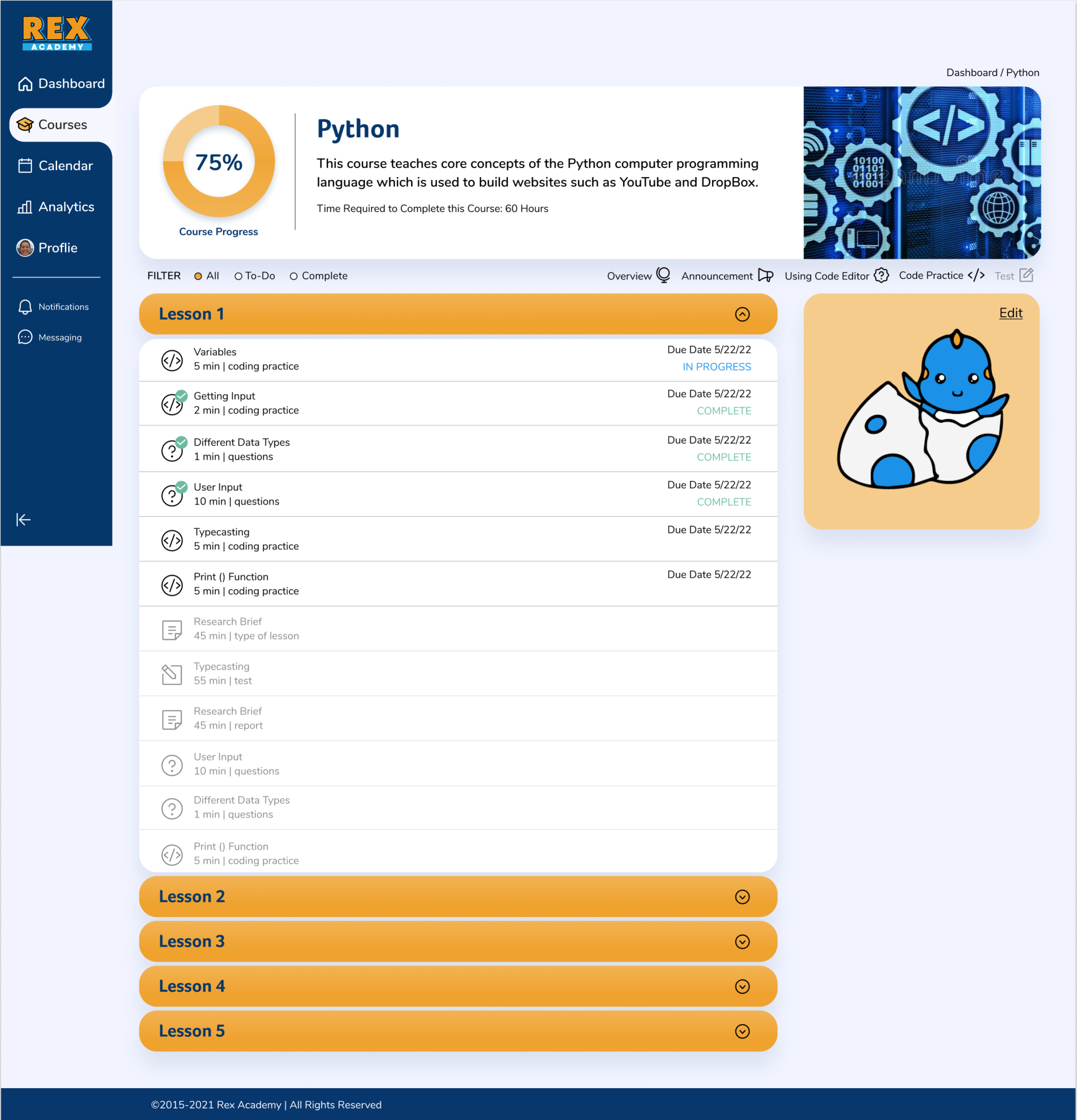
Lesson 1 is open and the filter is set to show all of the tasks in this lesson.
58%
when using the site the number of users who described it as “easy-to-navigate” increased by 58%
83%
more users found the new UI “appealing and engaging”
100%
of users tested on the prototype were able to correctly answer questions about course progress and next steps.
See it in action.
Play the short video above to view a narrated prototype of the Course Overview pages.


